5 Signs Your Product Needs a UX Redesign (Before Users Leave)
Most founders know something is wrong before they can name it. Conversion is lower than it should be. Support tickets keep asking the same questions. Users who sign up don’t come back. These are not marketing problems — they are UX problems, and they compound every month you don’t address them.
Here are the five most reliable signals that your product’s user experience has become a liability, and what each one is costing you.
1. Your Churn Is High but Your Product Works
If users are signing up, using the product briefly, and leaving — even though the product does what it promises — the problem is almost always experience, not functionality. Users don’t churn because a feature is missing. They churn because finding, understanding, or using the feature costs more effort than the value they receive. This is the most expensive form of poor UX because it is invisible in the product metrics.
2. Support Volume Is Growing With Users
Every support ticket is a UX failure that reached a human. Good information architecture, clear labelling, and properly sequenced onboarding eliminate the majority of support questions before users think to ask them. When your support volume scales proportionally with your user base instead of flattening, your interface is generating confusion at a consistent rate — and each ticket has a real dollar cost attached to it.
3. Your Onboarding Completion Rate Is Below 50%
Industry benchmarks vary, but most SaaS products see 60–80% of new users fail to complete onboarding and reach their first meaningful action. If yours is below 50%, users are arriving, deciding the product is too difficult or unclear, and leaving before they have experienced any value. No amount of new feature development recovers users lost at this stage — only redesigning the entry experience does.
4. Your Product Has Grown but Your Design Hasn’t
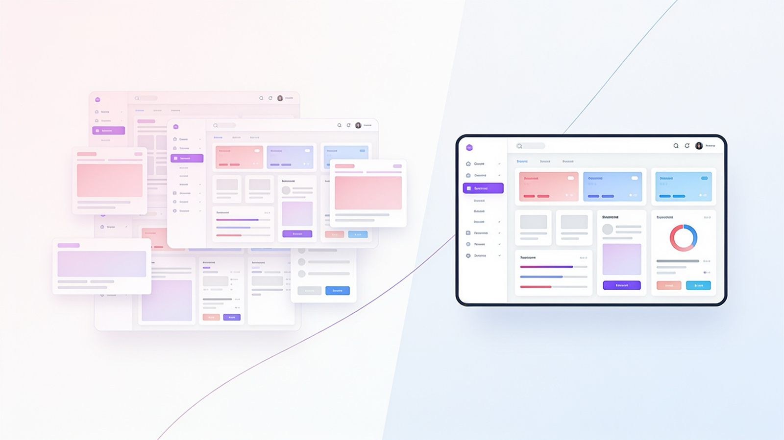
Early-stage products are built feature-by-feature, each addition made by a different person at a different time with different assumptions. After two or three years, the result is a product with inconsistent patterns, competing visual languages, and navigation that made sense at launch but is now a maze. Users feel this as friction even if they can’t describe why. When a product looks like it was assembled rather than designed, trust erodes — especially with enterprise buyers whose purchasing decision is partly an aesthetic one.
5. You’re Losing Enterprise Deals at the Demo Stage
If your product is functionally competitive but you’re losing evaluations to competitors whose product does less — look at the interface. Enterprise buyers are making a bet on your company’s professionalism, stability, and attention to detail. A polished, coherent interface signals all three. A dated or inconsistent one signals the opposite, regardless of what’s under the hood.
If you’re interested in the quantitative case for investing in UX, our post on the hidden UX tax breaks down the revenue impact in detail. And for teams thinking about how to approach the design phase of a rebuild, our guide on designing for context covers the principles that separate adaptive interfaces from static ones.
Ready for a UX audit?
Syntaxa’s design audit process maps every friction point in your product against business metrics — so you know which redesign decisions have the most impact before a single pixel moves.